Get the Most Out of Your Images
Having a user-friendly web page with content visitors expect to find, and can actually use, should always be your goal. Pages can also be attractive with the use of content appropriate images.
Are you using images on your pages? If so, have you thought much about what you post and the impression they make on your visitors?
Images can generate a TON of traffic from image-based search engines.
The following tips, tricks, and guidelines can help make your images top notch!

© P. G. Champion / Wikimedia Commons
Meet Professor Heinz Siegfried Wolff!Such a handsome fellow. He's been kind enough to be our image model today.

Are my images named correctly?
Years ago people did web only searches. Today we search via images, videos, maps, etc.
If your image is named "img_45345.jpg", no one will find it. This name means nothing.... especially to search engines. If you named it "Professor-Heinz-Wolff-Lamar-University.jpg", then it’s likely Google will display your image in the results.
- Use relevant keywords for image file names
- keep the file name to approximately five words or less
- use a hyphen (-) between words without spaces
Naming your images carefully will help visitors find you. Put some thought into it!
Have my images been sized properly?
Professor Wolff looks like he belongs in a funhouse not a classroom. When sizing your images, make sure they are constrained. Improper sizing conveys to your visitors that you don't know what you're doing.

Constraining an image keeps it's width and height in proportion.
The CMS helps site editors keep everything constrained by automatically adjusting the height when you change the width, or vice versa. Below is an example of what site editors see when they "edit" an image.
My original image was 604 pixels wide and I chose to make it 560px.
The editing feature automatically adjusted my height to 555px and kept the image constrained. Goodbye funhouse. Hello perfectly sized images!!

Be sure to click the checkmark icon to save your changes.
Need Help Sizing Images?
To size images outside of the CMS, we recommend Adobe Photoshop or using an online image editor like pixlr.
Visit: https://pixlr.com/x/
Are you using good alt tags (SEO)?
Screen readers use the alt text to provide visitors with a text equivalent of the image.
Alternative text (image description) is required for all images in the CMS and are very important for people with disabilities. Like the title of your image, alt tags are also important for Search Engine Optimization (SEO)
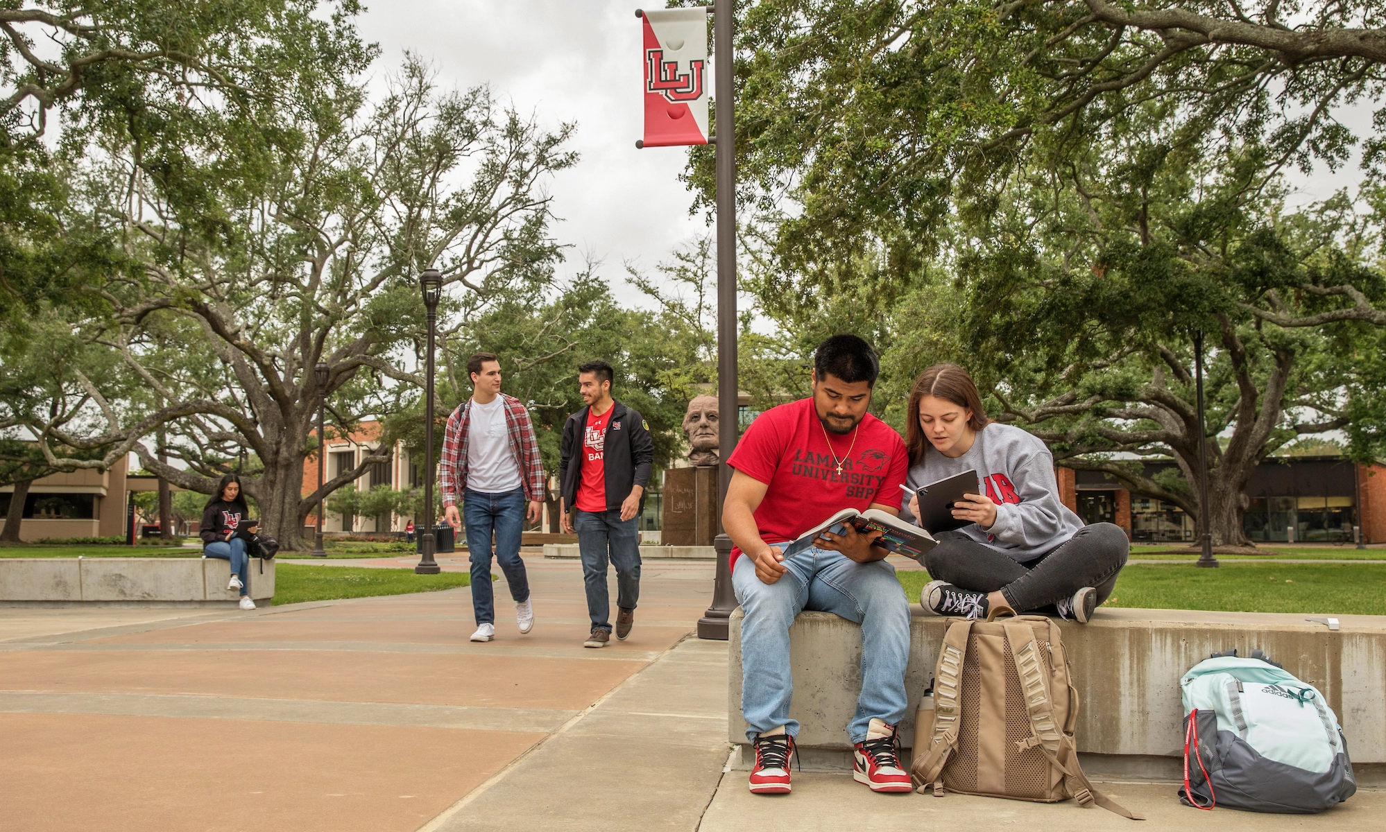
 When you see a campus photo, like the one featured here, you instantly recognize what’s going on in the picture. This instant recognition is not possible for search engines at this time. You must help these web crawlers understand each of your images with descriptive text.
The alt text should let users and search engines know what an image’s content and purpose are. This image might reside on an Admissions Page.
The alt tag for this image could be:
"Lamar University students - Admissions Status" or
"Lamar University Admission Status - Students on Campus"
Are they optimized for faster downloads?
The smaller your image, the faster it downloads. Visitors do not want to wait for your images to load on the page. The CMS limits uploads to 300k.
This does not mean you cannot have an image that is large. You must, however, optimize that image using image editing software or optimizing tools. If you need assistance, please contact Stacey.
The images here are almost the same download size. Both images are between 130- 137 Kb. Optimization allows for this.
Are they appropriate and in good taste?
Make sure the image is relevant to the content on the page and reflects positively on the University. Images of students sleeping in class would NOT be a good choice. (not likely to happen, but you get the "picture")
Please take some time and really look at the image.
Put yourself in the visitors shoes:
- How does it make you feel about the University, Department, the students that attend, etc?
- Is it inviting and does it improve the content of your page?
A little extra time spent asking these questions will help make a great impression, improve your "image", and get repeat visitors.


